
How it all began: February
In February 2026 I started with the Peloton bike. The appeal for me: it’s measurable. Every session delivers numbers, distance, power, cadence, and I see in black and white whether I’m making progress. For someone who wants to keep their metabolism in their own hands, that’s worth its weight in gold.
Where I stand today: the numbers
From the build-up of recent months, a few metrics have emerged that I’m proud of. As a representative example, a documented 30-minute session:
The number that matters most to me is the personal 30-minute record of 285. Not because the figure itself is important, but because it shows: I’m more capable today than in February. Continuity beats intensity.
The most active day so far
A highlight was 17 July: on a single day, around 18.7 km on foot (while exploring Munich) and 29.61 km on the Peloton came together: almost 48 km of movement in total. The impressive part wasn’t the distance, but the effect on my blood sugar: despite hearty food it stayed largely in the target range. The whole analysis is in “How movement buffers everything”.
Why strength training joins now
So far my focus was on the bike. From now on I’m deliberately adding strength training at the gym during the week. The reason isn’t looks, but metabolism: more muscle mass means more “storage space” for glucose and supports insulin sensitivity long-term. Endurance and strength complement each other: one lowers acutely, the other builds the foundation. How differently my blood sugar reacts to both kinds of exertion I’ve described in “Blood sugar during training” and “Exercise: down first, then up”.
A look ahead to edition 2
The next edition gets concrete: the first full month with average time in range, the weight trend and an honest verdict on how the combination of bike and strength feels in everyday life. All documented via daily check-ins.
Key takeaways
- Start of Peloton training in February 2026: chosen because it’s measurable.
- Personal 30-minute record: 285 – research of progress since the start.
- Most active day (17 Jul): almost 48 km (walking + bike), blood sugar stable despite hearty food.
- From now on strength training is added – for long-term insulin sensitivity.
- From edition 2: real monthly values (time in range, weight, later HbA1c).
The original measurement record remains unchanged. This section adds only method, sources, limitations and a reproducible follow-up plan.
The central question in this article
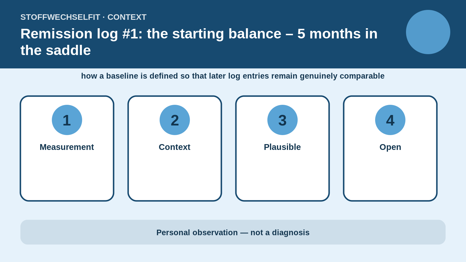
The article “Remission log #1: the starting balance – 5 months in the saddle” examines how a baseline is defined so that later log entries remain genuinely comparable. The quality test is not whether one curve creates a compelling story. It is whether the timeline, data source, surrounding circumstances and alternative explanations are documented well enough for readers to separate observation from interpretation.
What the data show — and what they do not
A personal series can show timing and recurring patterns. It cannot by itself prove which physiological mechanism caused the pattern. Direct observation, plausible explanation and open question are therefore separated. Numbers remain linked to unit, time and data source, and missing details are not replaced with guesses.
Reading CGM correctly
Continuous glucose monitoring measures interstitial glucose. During rapid rises or falls, the display may follow blood glucose with a delay. Pressure on the sensor, a newly inserted sensor, hydration and short data gaps can add uncertainty. When a reading does not match symptoms or the situation, a confirmatory measurement may be appropriate depending on the clinical significance.
Technical context: CGM data and long-term patterns
A CGM measures glucose in interstitial fluid rather than directly in blood. During rapid change, sensor glucose and blood glucose may differ. Compression, newly inserted sensors, gaps and technical interruptions therefore need to remain visible. Long-term data are more credible when coverage and downtime are reported alongside averages. A month with only a few sensor days is not automatically comparable with a nearly complete month. Outliers should neither be removed without a rule nor presented dramatically without context.
Article-specific interpretation
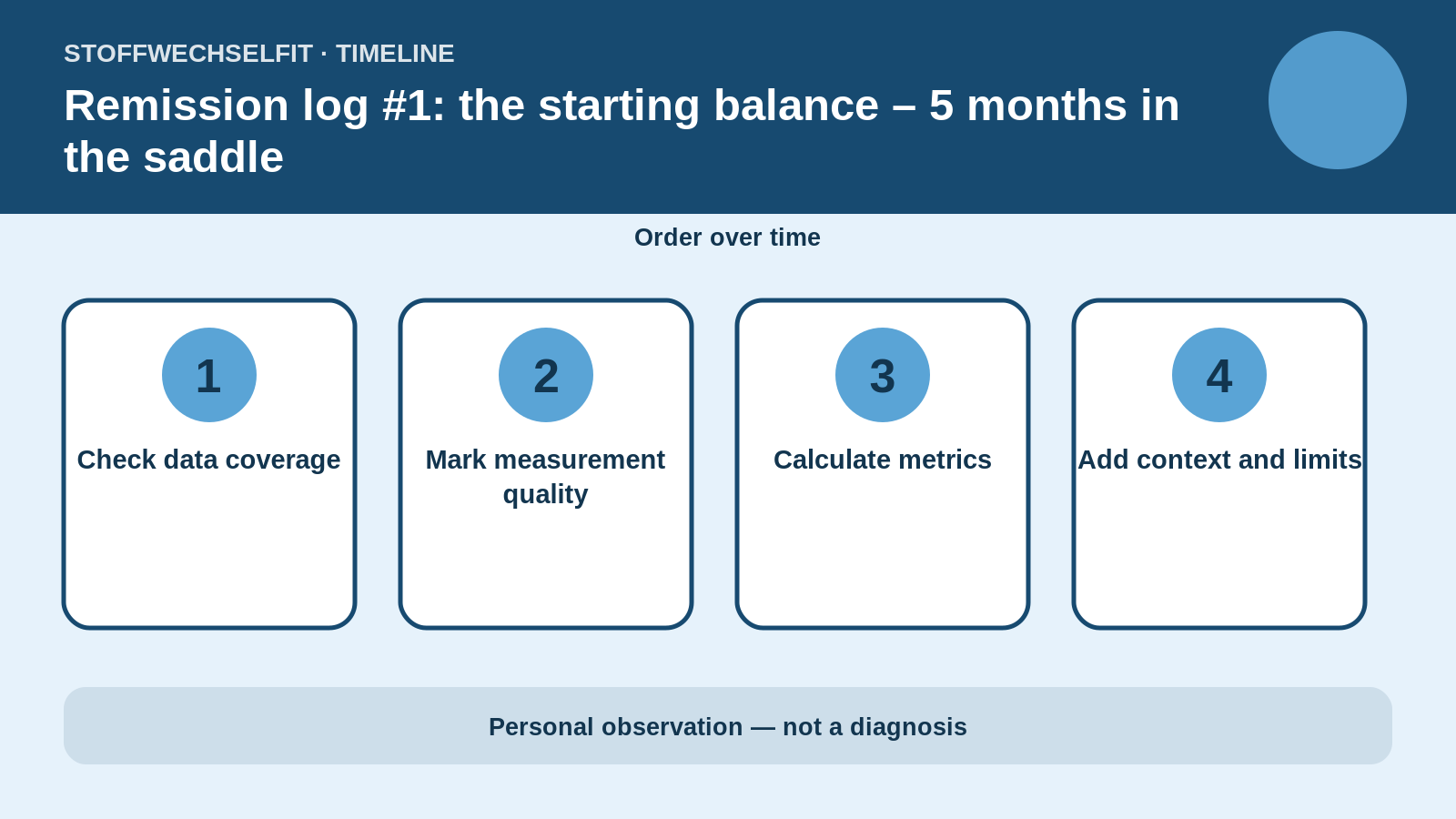
For “Remission log #1: the starting balance – 5 months in the saddle”, this means first establishing which of the four phases — Check data coverage, Mark measurement quality, Calculate metrics, Add context and limits — are actually documented. A missing phase is not guessed from the curve. This matters especially because how a baseline is defined so that later log entries remain genuinely comparable. More decimal places do not improve research; more complete context does.
Alternative explanations
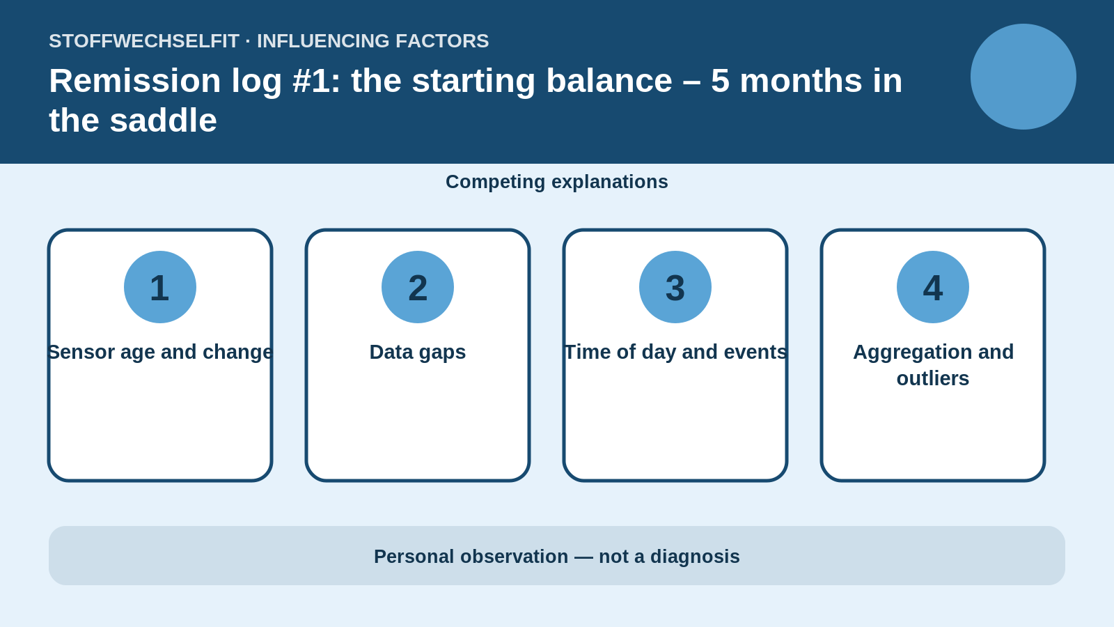
The competing influences considered are Sensor age and change, Data gaps, Time of day and events, Aggregation and outliers. Several can act at once and partly mask one another. No factor is therefore declared causal merely because it occurred close in time. A plausible explanation remains labelled as plausible until a targeted comparison supports it.
Data sheet and provenance
The data sheet for “Remission log #1: the starting balance – 5 months in the saddle” records more than the start and peak. It also covers Check data coverage, Mark measurement quality, Calculate metrics and Add context and limits. Each section states whether a value was measured directly, read from a screenshot, calculated from raw data or reconstructed from memory. This keeps strong research separate from details that require later verification.
Typical failure modes
Common failure modes in this topic are incomplete portions, an incorrect time origin, events added retrospectively and observation ending too soon. For “Remission log #1: the starting balance – 5 months in the saddle”, Sensor age and change and Time of day and events are particularly important competing explanations. A finding is therefore given more weight only when the same direction appears on several sufficiently similar days and counterexamples are documented as well.
Editorial decision
The editorial decision is to keep the personal experience visible without turning it into universal advice. Headline, hero image, alternative text, captions and conclusion must communicate the same uncertainty. When the article contains an open question, it ends with the next testable step — Preserve raw data — rather than a claim of effect.
Interpretation matrix
The interpretation matrix for “Remission log #1: the starting balance – 5 months in the saddle” assigns every core statement to one of four classes: directly measured, calculated from several readings, physiologically plausible or still open. Direct measurement does not automatically establish causation. A calculated result requires a documented formula and time window. Plausible means consistent with physiology and timing but not isolated in the personal data. Open means that data, repetitions or comparison conditions are missing.
Publication review
Before publication, a final review asks whether the hero image matches the actual message of “Remission log #1: the starting balance – 5 months in the saddle”, whether every number can be found in the text, whether units and timing are correct, and whether every image has alternative text and a caption. It also checks that Sensor age and change or Data gaps has not accidentally been turned into a proven cause. Only then is the article editorially complete.
Reproducible follow-up plan
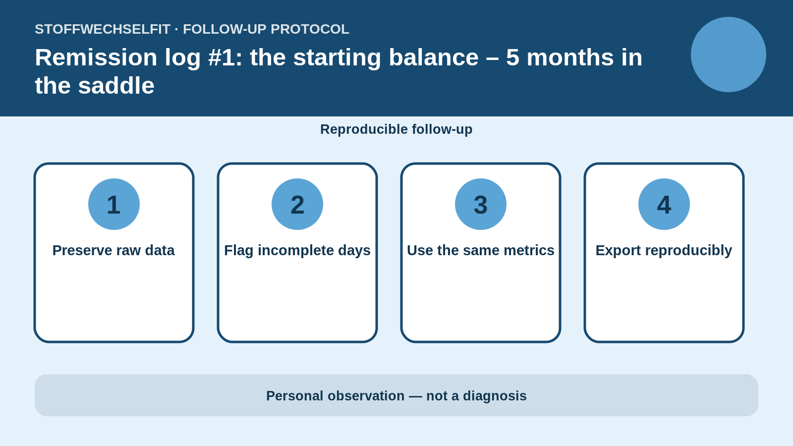
The next useful comparison follows four steps: Preserve raw data, Flag incomplete days, Use the same metrics, Export reproducibly. This sequence turns a spontaneous observation into a protocol and reduces the risk of selecting only spectacular days while forgetting ordinary patterns.
What can be transferred
The transferable lesson from “Remission log #1: the starting balance – 5 months in the saddle” is therefore not necessarily the exact number. What transfers are the question, the documented conditions and the handling of uncertainty. Other people may respond very differently because of treatment, fitness, insulin sensitivity, digestion or comorbidity.
Comparison rather than snapshot
A credible comparison starts with one clear question and conditions that are as similar as possible. Starting value, trend, time, portion, drinks, activity, sleep, stress and medication all belong in the record. Not every factor can be controlled; the important point is to show differences rather than explain them away afterwards.
State the observation window
Thirty minutes answers a different question from two, four or twelve hours. The article therefore states when observation begins and recognises that mixed meals, alcohol or intense activity can act later. A peak is not interpreted without the pattern before and after it.
Personal readings are not universal limits
Typical guideline targets can provide orientation but require individualisation. Age, comorbidities, pregnancy, medication, hypoglycaemia risk and personal treatment goals change the interpretation. The self-observations shown here do not replace diagnosis or treatment decisions.
Practical safety framework
Marked symptoms, recurrent hypoglycaemia, very high readings, ketones or a pattern that does not fit the situation require clinical assessment rather than another self-experiment. People using insulin or glucose-lowering medication must not derive dose changes or corrections from a blog post.
Further technical limitations
Metrics such as mean glucose, variability, time in an individually defined range and coverage answer different questions. They do not replace laboratory values or clinical assessment. In particular, remission cannot be established from a CGM chart alone. A reproducible analysis records export date, time zone, sensor version, filtering rules and calculation method. This is the only way to explain later why two analyses of similar raw data may differ.
Questions before drawing a conclusion
- Is the starting value for “Remission log #1: the starting balance – 5 months in the saddle” documented with trend and time?
- Are Sensor age and change and Data gaps described adequately?
- Did observation continue through “Add context and limits”?
- Is there a comparison day after “Preserve raw data”?
- Is each statement clearly labelled as personal, plausible or generally established?
Sources and context
- American Diabetes Association: Standards of Care in Diabetes—2026, glycaemic goals
- American Diabetes Association: Standards of Care in Diabetes—2026, diabetes technology
- NIDDK: Healthy Living with Diabetes
- Abbott: difference between interstitial and blood glucose
- American Diabetes Association: Standards of Care in Diabetes—2026, health behaviours and exercise
Medical notice: This article explains a personal observation and general context. It does not replace diagnosis, treatment adjustment or emergency care.