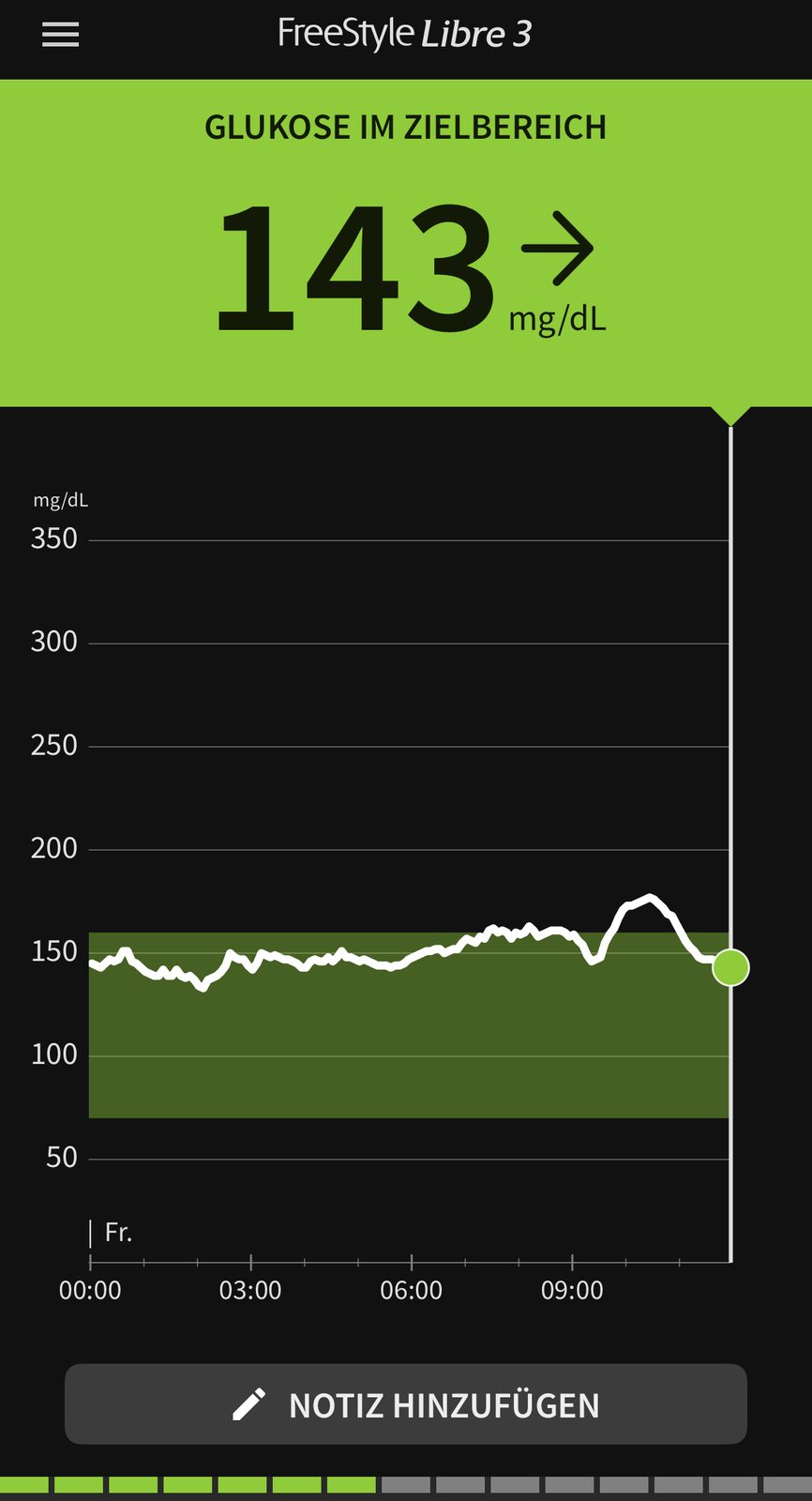
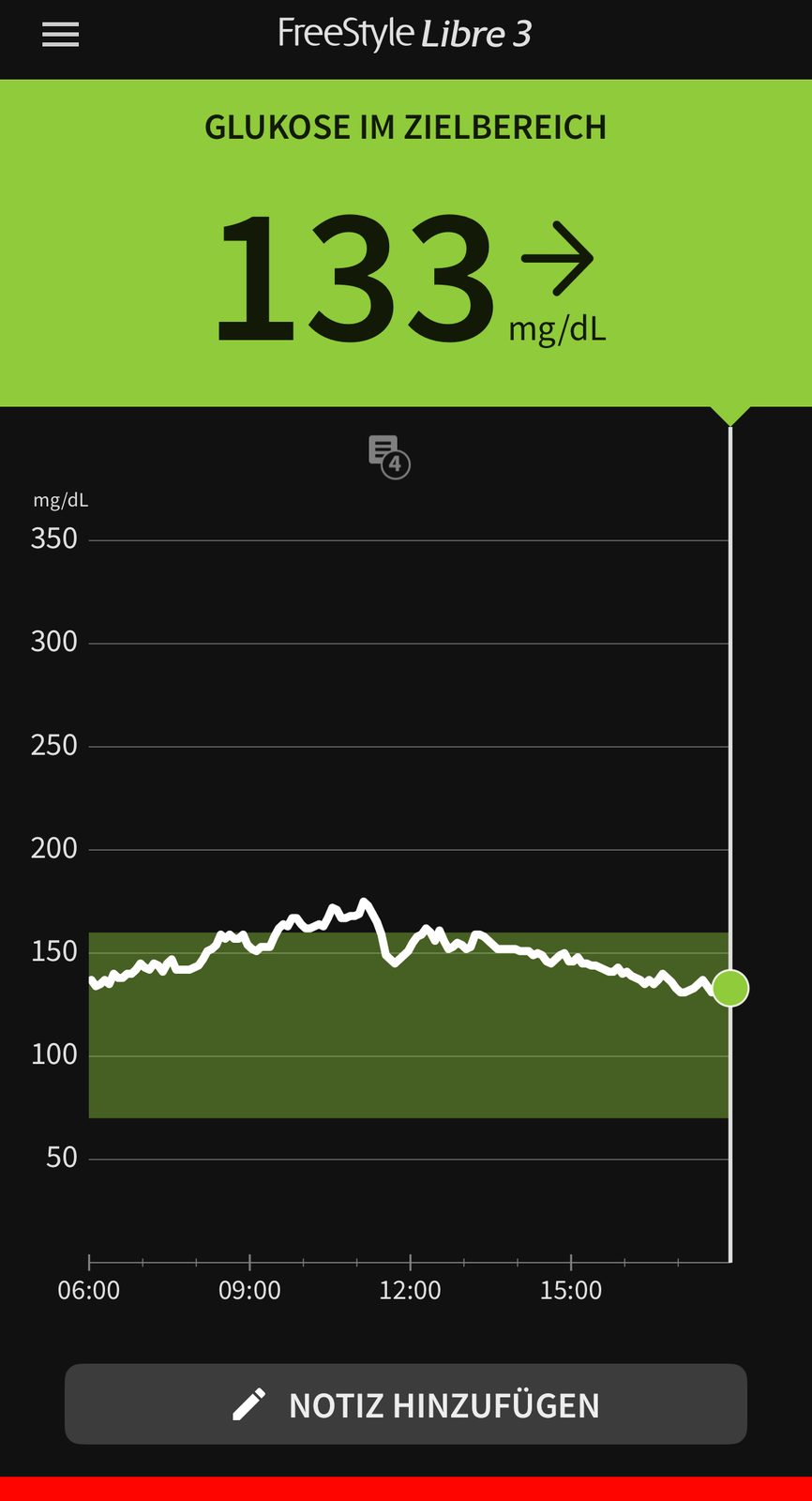
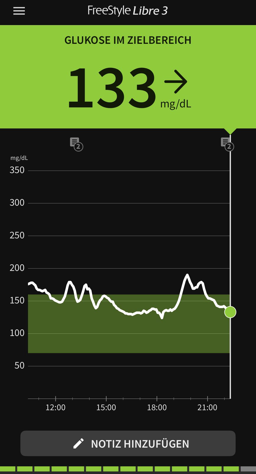
Seven months, one sensor, no medication. This page shows how my readings changed — with the reports from the app, exactly as they appear there.
A single-case record. I show what happened to me, not what will happen to you. What I changed — food, movement, sleep — worked in my situation. Whether it works in yours is a question for your medical team.
Seven months in figures
The percentages in this article are calculated from the raw sensor export, not read off the app screens. The app uses the configured target range of 70 to 160 mg/dl and therefore shows different shares.
Calculated from the raw sensor export — not read off the app screens.
January 2026
February 2026
March 2026
April 2026
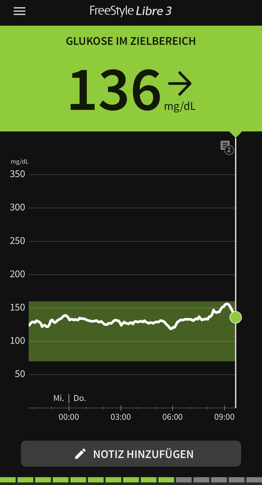
May 2026
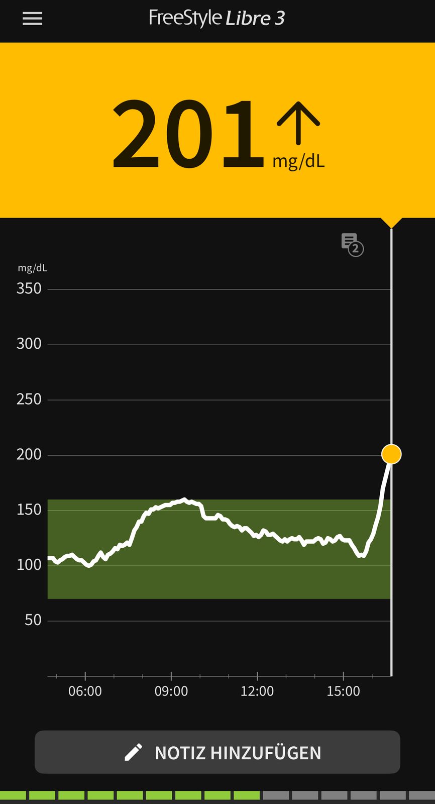
June 2026
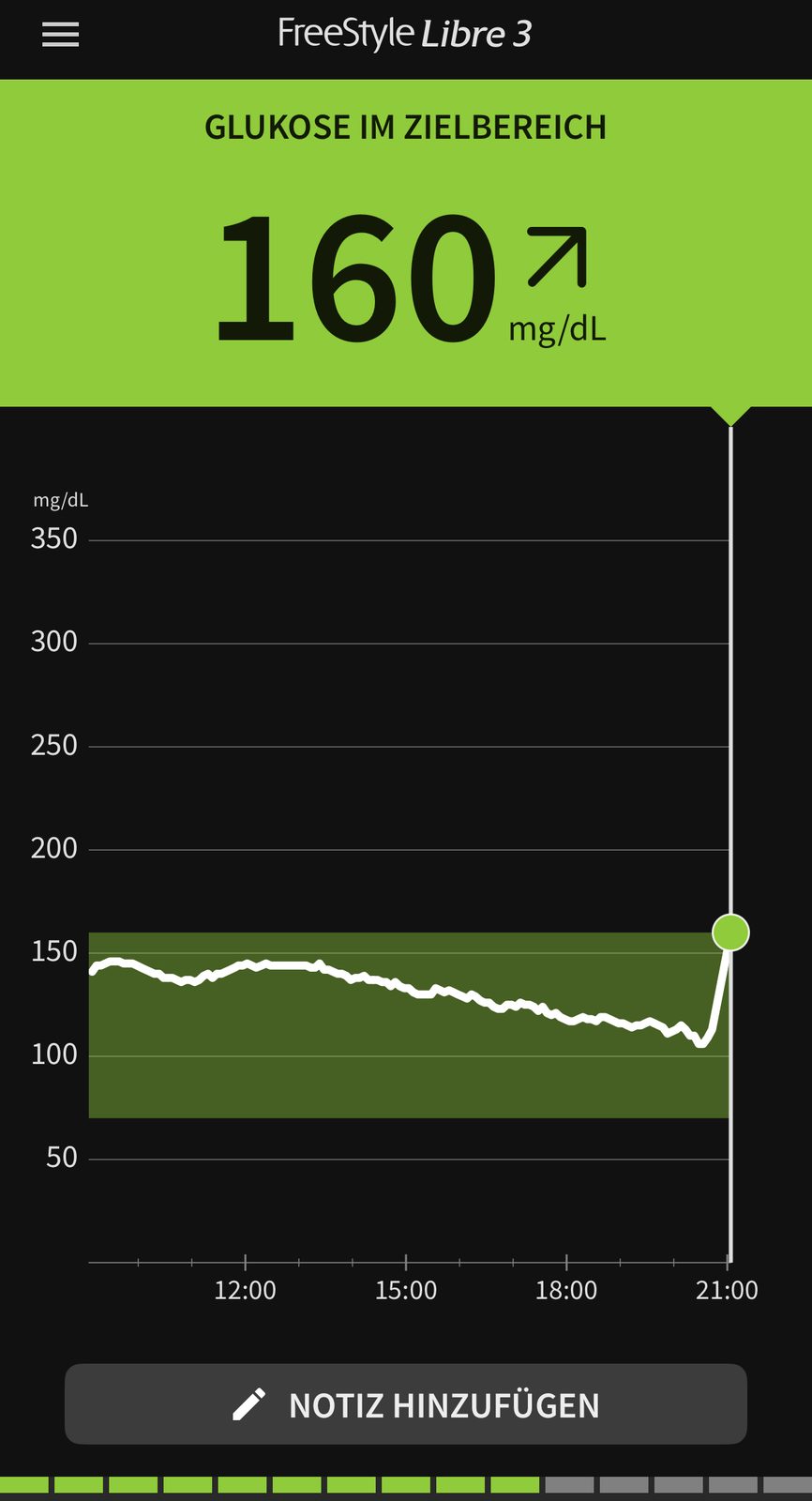
July 2026
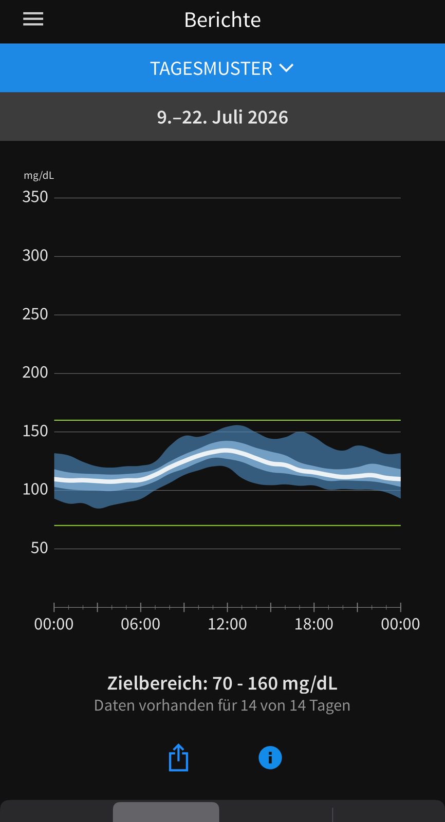
What changed during this time
Three things I kept up: a twenty-minute walk after larger meals, fewer carbohydrates at dinner, and regular training — steady endurance work plus strength sessions.
What I did not do: skip meals, go hungry, or treat supplements as a substitute.
These reports show a development over seven months. They do not show which single measure contributed how much — separating the influences is not possible in everyday life. Season, stress and sleep play their part too.
Key points
- Seven months of continuous measurement with the same type of sensor.
- Time in range increased noticeably over this period.
- What changed: movement after meals, the composition of dinner, and training.
- A single observation — no reliable proof that it works the same way for others.
Single-case record, not a study.
The original measurement record remains unchanged. This section adds only method, sources, limitations and a reproducible follow-up plan.
The central question in this article
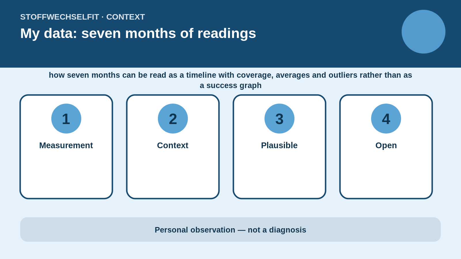
The article “My data: seven months of readings” examines how seven months can be read as a timeline with coverage, averages and outliers rather than as a success graph. The quality test is not whether one curve creates a compelling story. It is whether the timeline, data source, surrounding circumstances and alternative explanations are documented well enough for readers to separate observation from interpretation.
What the data show — and what they do not
A personal series can show timing and recurring patterns. It cannot by itself prove which physiological mechanism caused the pattern. Direct observation, plausible explanation and open question are therefore separated. Numbers remain linked to unit, time and data source, and missing details are not replaced with guesses.
Reading CGM correctly
Continuous glucose monitoring measures interstitial glucose. During rapid rises or falls, the display may follow blood glucose with a delay. Pressure on the sensor, a newly inserted sensor, hydration and short data gaps can add uncertainty. When a reading does not match symptoms or the situation, a confirmatory measurement may be appropriate depending on the clinical significance.
Technical context: CGM data and long-term patterns
A CGM measures glucose in interstitial fluid rather than directly in blood. During rapid change, sensor glucose and blood glucose may differ. Compression, newly inserted sensors, gaps and technical interruptions therefore need to remain visible. Long-term data are more credible when coverage and downtime are reported alongside averages. A month with only a few sensor days is not automatically comparable with a nearly complete month. Outliers should neither be removed without a rule nor presented dramatically without context.
Article-specific interpretation
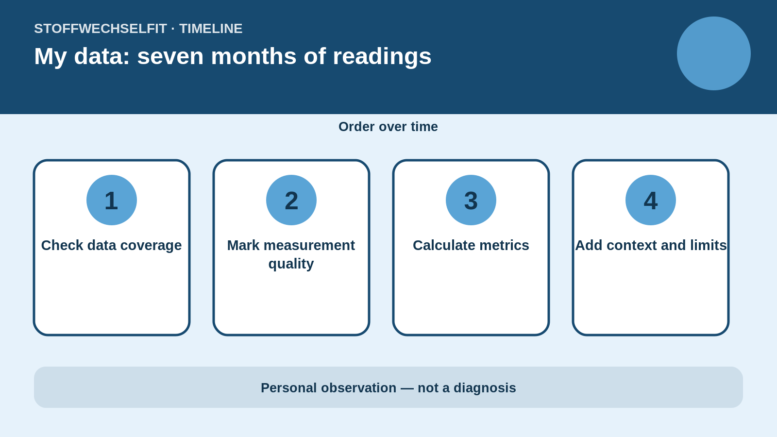
For “My data: seven months of readings”, this means first establishing which of the four phases — Check data coverage, Mark measurement quality, Calculate metrics, Add context and limits — are actually documented. A missing phase is not guessed from the curve. This matters especially because how seven months can be read as a timeline with coverage, averages and outliers rather than as a success graph. More decimal places do not improve research; more complete context does.
Alternative explanations
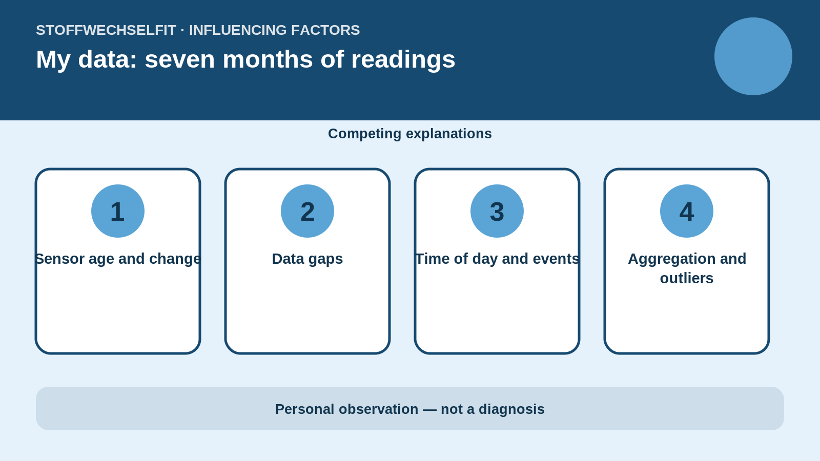
The competing influences considered are Sensor age and change, Data gaps, Time of day and events, Aggregation and outliers. Several can act at once and partly mask one another. No factor is therefore declared causal merely because it occurred close in time. A plausible explanation remains labelled as plausible until a targeted comparison supports it.
Data sheet and provenance
The data sheet for “My data: seven months of readings” records more than the start and peak. It also covers Check data coverage, Mark measurement quality, Calculate metrics and Add context and limits. Each section states whether a value was measured directly, read from a screenshot, calculated from raw data or reconstructed from memory. This keeps strong research separate from details that require later verification.
Typical failure modes
Common failure modes in this topic are incomplete portions, an incorrect time origin, events added retrospectively and observation ending too soon. For “My data: seven months of readings”, Sensor age and change and Time of day and events are particularly important competing explanations. A finding is therefore given more weight only when the same direction appears on several sufficiently similar days and counterexamples are documented as well.
Editorial decision
The editorial decision is to keep the personal experience visible without turning it into universal advice. Headline, hero image, alternative text, captions and conclusion must communicate the same uncertainty. When the article contains an open question, it ends with the next testable step — Preserve raw data — rather than a claim of effect.
Interpretation matrix
The interpretation matrix for “My data: seven months of readings” assigns every core statement to one of four classes: directly measured, calculated from several readings, physiologically plausible or still open. Direct measurement does not automatically establish causation. A calculated result requires a documented formula and time window. Plausible means consistent with physiology and timing but not isolated in the personal data. Open means that data, repetitions or comparison conditions are missing.
Publication review
Before publication, a final review asks whether the hero image matches the actual message of “My data: seven months of readings”, whether every number can be found in the text, whether units and timing are correct, and whether every image has alternative text and a caption. It also checks that Sensor age and change or Data gaps has not accidentally been turned into a proven cause. Only then is the article editorially complete.
Reproducible follow-up plan
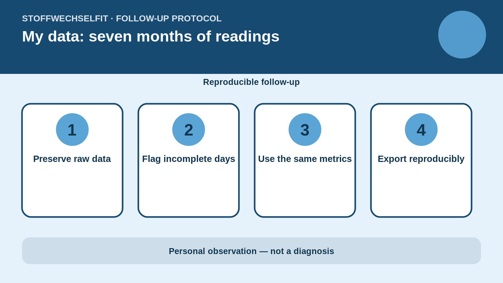
The next useful comparison follows four steps: Preserve raw data, Flag incomplete days, Use the same metrics, Export reproducibly. This sequence turns a spontaneous observation into a protocol and reduces the risk of selecting only spectacular days while forgetting ordinary patterns.
What can be transferred
The transferable lesson from “My data: seven months of readings” is therefore not necessarily the exact number. What transfers are the question, the documented conditions and the handling of uncertainty. Other people may respond very differently because of treatment, fitness, insulin sensitivity, digestion or comorbidity.
Comparison rather than snapshot
A credible comparison starts with one clear question and conditions that are as similar as possible. Starting value, trend, time, portion, drinks, activity, sleep, stress and medication all belong in the record. Not every factor can be controlled; the important point is to show differences rather than explain them away afterwards.
State the observation window
Thirty minutes answers a different question from two, four or twelve hours. The article therefore states when observation begins and recognises that mixed meals, alcohol or intense activity can act later. A peak is not interpreted without the pattern before and after it.
Personal readings are not universal limits
Typical guideline targets can provide orientation but require individualisation. Age, comorbidities, pregnancy, medication, hypoglycaemia risk and personal treatment goals change the interpretation. The self-observations shown here do not replace diagnosis or treatment decisions.
Practical safety framework
Marked symptoms, recurrent hypoglycaemia, very high readings, ketones or a pattern that does not fit the situation require clinical assessment rather than another self-experiment. People using insulin or glucose-lowering medication must not derive dose changes or corrections from a blog post.
Further technical limitations
Metrics such as mean glucose, variability, time in an individually defined range and coverage answer different questions. They do not replace laboratory values or clinical assessment. In particular, remission cannot be established from a CGM chart alone. A reproducible analysis records export date, time zone, sensor version, filtering rules and calculation method. This is the only way to explain later why two analyses of similar raw data may differ.
Questions before drawing a conclusion
- Is the starting value for “My data: seven months of readings” documented with trend and time?
- Are Sensor age and change and Data gaps described adequately?
- Did observation continue through “Add context and limits”?
- Is there a comparison day after “Preserve raw data”?
- Is each statement clearly labelled as personal, plausible or generally established?
Sources and context
- American Diabetes Association: Standards of Care in Diabetes—2026, glycaemic goals
- American Diabetes Association: Standards of Care in Diabetes—2026, diabetes technology
- NIDDK: Healthy Living with Diabetes
- Abbott: difference between interstitial and blood glucose
- American Diabetes Association: Standards of Care in Diabetes—2026, health behaviours and exercise
Medical notice: This article explains a personal observation and general context. It does not replace diagnosis, treatment adjustment or emergency care.
Sources
This entry is based on my own sensor readings. Where studies are mentioned, they are linked in the text. Continuous glucose monitoring: FreeStyle Libre 3.
Recalculated from the complete CSV export
The earlier image selection included daily screenshots that could be mistaken for monthly summaries. This graph uses only the CSV export. Calculated GMI is a CGM estimate, not a laboratory HbA1c.